
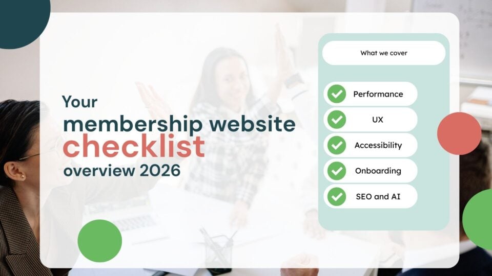
The membership website: DIY essentials checklist for 2026
Running a membership website is no easy feat, and in the middle of managing events, volunteers, donations and systems it is hard to sit back and take a holistic look at what your organisation could do better. This is why we’ve come up with a membership essentials checklist for your association, an easy way for you to check if you are following the basic industry best practices or to identify what you need to review in 2026.
All of the below can be done by yourself, in-house, without the need for a developer, so you can improve today! Let’s dive into it…
- UX essentials for membership organisations
- 1. Performance
- 2. Above the fold content
- 3. Does your content meet the user's needs?
- 4. Shorten what you can
- Accessibility basics for membership organisations
- 1. Alternative text for your images
- 2. Clear heading structure
- 3. Descriptive links
- SEO, AEO and GEO fundamentals for membership organisations.
- 1. Prioritise E-E-A-T
- 2. Internal linking
- 3. Create "answer-ready" content
- 4. Local landing pages
- Conclusion
UX essentials for membership organisations
Before we get into the nitty-gritty, here are some interesting stats you may not have known when it comes to user experience.
1. Performance
According to Techjury, a single second delay in a page load leads to a 7% decrease in conversion rates (!). Not the most obvious point, but the focus of your membership site should always be performance. Performance affects the user even before they see your content, so if the wait times are too long it can really demotivate the potential user and they will bounce off your membership website. It might be really tempting to give your site cool animations or razor-sharp images, but if your site is being slowed down because of these elements, then you may need to reconsider. Your users won’t even get to see your cool animations if the site loads too slowly for them.
2. Above the fold content
Prioritise above-the-fold clear value proposition so your users know exactly what they are getting at first glance. According to Omnicovert, visitors often form opinions about a website within 0.05 seconds. A well-designed “above the fold” section can capture their attention instantly. Consider if the following are clearly placed above the fold on your website:
- Clear value proposition: make the headline and subheadline concise but clear about what exactly it is you are offering. It instantly answers “what’s in it for me?” and demonstrates relevance.
- Primary call to action: a clear, high-contrast button that prompts a specific action. Think “join now,” “become a member,” “request a demo,” or “sign up”.
- Instant trust indicators (social proof): include small, impactful elements that build credibility instantly, such as a count of members, testimonials, or logos of partnerships.
3. Does your content meet the user’s needs?
Even the fastest site in the world will not help your retention if the content on your site doesn’t answer the needs of the users landing on it. In the age of ChatGPT, users can get the answer to their questions within seconds and it is key that your content is refined for this new age of search. If the information you are feeding is inaccurate then you missed a window of opportunity, and you will struggle to maintain trust with your visitors and word will spread quickly.
Run an exercise whereby you look at your most regular demographic and see what they are interested in, what they search, how they search and make sure you are making your content attainable and available to that demographic.
Interested in a third party doing the audit? Here is a free opportunity for us to have a look at your membership site.
4. Shorten what you can
In the age where data is king, we all want to collect the most information possible. However, your users will desire the quickest and easiest way to onboard or receive information. It is important you answer that call and ensure your onboarding is as quick and as easy as it can be. Make forms as short as they need to be and give the user instant access to whatever it is they are signing up to (if possible).
The following are some vital UX considerations when it comes to onboarding:
- Get your user motivated. Users are more likely to sign up if they feel they are exchanging data for a reward. Even better if it is instant.
- Don’t present technical limitations like making your user install new software or plugins. These are immediate red flags for most users and you don’t want to lose anyone’s trust.
- Make the user feel instantly welcomed. An email is common but an onboarding video may make a better first impression and put a name to a face.
- Immediately demonstrate the value of membership, such as pointing the user toward content relevant to their interests.
Accessibility basics for membership organisations

For membership organisations, being accessible means ensuring that all digital and physical services from joining forms to member forums are usable by everyone, including people with visual, auditory, motor, or cognitive disabilities. Membership websites should at least meet the WCAG 2.2 AA standards. To help, here is the breakdown of what you can do as an organisation to improve your accessibility:
1. Alternative text for your images
Alt text (alternative text) is a short, written description added to HTML image tags that describes the appearance and context of visual content. It is used primarily for web accessibility, allowing screen readers to describe images to visually impaired users, improving SEO by helping search engines understand content, and providing text if images fail to load. If you have a CMS like WordPress, then there may already be a section under your image upload settings to place alt text. No need for any coding experience to insert this.
Here is how to write effective alt text:
- Keep it concise (under 100 words)
- Make it descriptive, accurately conveying the image’s purpose without using phrases like “image of”.
- Focus on key elements of the image, use normal punctuation, and avoid repeating adjacent text.
- For decorative images, leave the alt text empty.
2. Clear heading structure
Instead of using bold text, make sure your content is organised logically. To do this use proper HTML headings (think H1, H2, H3). Screen readers and search engines vastly depend on proper heading tags to understand the structure of your page. It matters very little, if at all, if your text is italicised or underlined if you are not using the above options.
3. Descriptive links
Descriptive links are essential for improving web accessibility, usability, and SEO by clearly indicating a link’s destination and purpose. They help users scan content, find information faster, prevent confusion, and are critical for screen reader users who may navigate by jumping from link to link.
Best practices for creating links:
- Instead of “click here to read more,” use “read the full marketing report”.
- Use action words and start with verbs like “download,” “view,” or “read”.
- Never use “click here,” “more,” or “read more”.
- Ensure the link text makes sense out of context.
SEO, AEO and GEO fundamentals for membership organisations.

If you followed the above and made it this far, then there is a good chance that your search engine optimisation (SEO) is already in good shape, or near enough. After all, UX and accessibility play a big part in search engine optimisation.
However, in 2026, SEO and generative engine optimisation (GEO) are merging into a “search everywhere” strategy for membership organisations. This strategy focuses on visibility, authority, and trust rather than clicks. SEO helps a website rank on Google. GEO ensures the organisation is cited by AI tools like ChatGPT, Gemini, and Google’s AI overviews.
Here are some tips you can implement yourself to improve your visibility online:
1. Prioritise E-E-A-T
Everyone is talking about it, but what does E-E-A-T actually mean? Search engines reward experience, expertise, authoritativeness, and trustworthiness (EEAT) so the goal is to structure your written content in a way that reflects this formation.
Key components of E-E-A-T:
- Experience: evidence that your membership organisation has first-hand or real-life experience with the subject at hand. This in part, builds trust with your readers.
- Expertise: the level of knowledge, skill, or credentials your organisation possesses regarding the topic. The more you discuss a topic the more expertise you are showing to the search engines. Another way of building trust and showing credibility.
- Authoritativeness: the reputation of your association, website or content itself within the industry. This is where backlinking comes in useful. Make sure you do content swaps with reputable bodies in your field as that can really boost your authority too.
- Trustworthiness: the accuracy, safety, and transparency of the website, which is the core of the entire framework. Make sure your content is not exclusively about sales. This can really turn readers away and doesn’t necessarily convey transparency and safety to the reader.
Another way you can help your content be more visible is by publishing expert insights. Attribute content to industry experts and reference credible data and research so your site becomes the home to reliable information your readers can draw on.
2. Internal linking
Internal linking connects pages on the same website, acting as a roadmap for users and search engines to discover, understand, and rank content. By distributing link authority (ranking power) throughout a site and providing relevance, they significantly boost SEO, improve navigation, and increase user engagement. In short, use internal links to guide readers to related content, helping AI and users navigate your expertise.
Best practices for internal linking:
- Use descriptive anchor text: use relevant keywords in the clickable text to define the linked page. This is also the best practice for accessibility matters.
- Keep it relevant: link to content that adds value to the reader, enhancing the user experience of your membership website.
- Prioritise important pages: ensure top-tier content is only a few clicks away from the homepage. The more clicks the user has to do the bigger the chances that they will click off altogether.
- Avoid excessive linking: too many links on a single page can look spammy to search engines and users so link with a purpose.
- Check for broken links: regularly audit to remove or update broken, redirected, or irrelevant links.
3. Create “answer-ready” content
Creating “answer-ready” content is key to Answer Engine Optimisation (AEO). It involves structuring information so AI models and search engine features can easily find, extract, and cite content as the direct answer to a user’s query. The goal is to structure content for rapid consumption by AI, such as using FAQs, scannable lists, and clear definitions.
Unlike traditional SEO, “answer-ready” content aims to be a concise solution. It often serves users who may not click through to a website. So yes, in this day and age it is highly likely that your organic clicks will take a hit but that doesn’t mean you are not found online; it just means users are consuming content differently and you need to meet them where they are at.
How to ensure you create answer-ready content?
- AI scanners prioritise efficiency so place a direct, 1 to 2-sentence answer to the main question within the first 40–50 words.
- Break content into short, self-contained sections (75–300 words) that answer one specific query.
- For quick scanning, use bullet points, numbered lists, and tables to make content easy for AI to review and use.
4. Local landing pages
Local landing pages are dedicated website pages designed to rank for, and convert, users searching for services or products in specific geographic areas. By showing localised content, NAP (name, address, phone number) data, and location-specific keywords, these pages boost visibility in regional search results. If you want to be found in your location then create specific, detailed landing pages for each region to capture local search traffic.
Key components of a high-converting local landing page include:
- Unique, city-specific content (avoid duplicate text across locations).
- Consistent name, address, and phone number matching your Google Business Profile.
- Customer testimonials, local reviews, and photos of the specific location.
- Specific actions like “book in [city]” or “get a [city] quote”.
- Embedded Google Map, directions, and nearby landmarks.
Conclusion
This is quite a comprehensive list, so it is important to bear in mind that you don’t have to tackle everything at once. Pick one or two areas that stood out for you and start there. Incremental improvements, done consistently, are what build strong, future-proof membership platforms.
Remember, if you made it this far, then you are already ahead of the game. And if you’d like a second pair of eyes on your site, we’re always happy to help!