
Colour
For most brand identities, colour along with the name and logo, often forms some of the most easily recognisable elements.
A note on colour
All of our colours have been designed to give us a modern, fresh, bold look and feel and have been carefully created to be accessible.
If you’re not sure which colour text to use on top of background colour, use the colour contrast checker to make sure you’re achieving the correct level of contrast.
Primary colour palette
Our primary colours are the key colours we use. The green and mid grey colours are what we use for our logo. White can also be used for copy, provides it’s on a dark enough background – and can be used to help provide clear space within our communications. We tend to find our green is quite a strong colour, so we use it sparingly and with purpose.
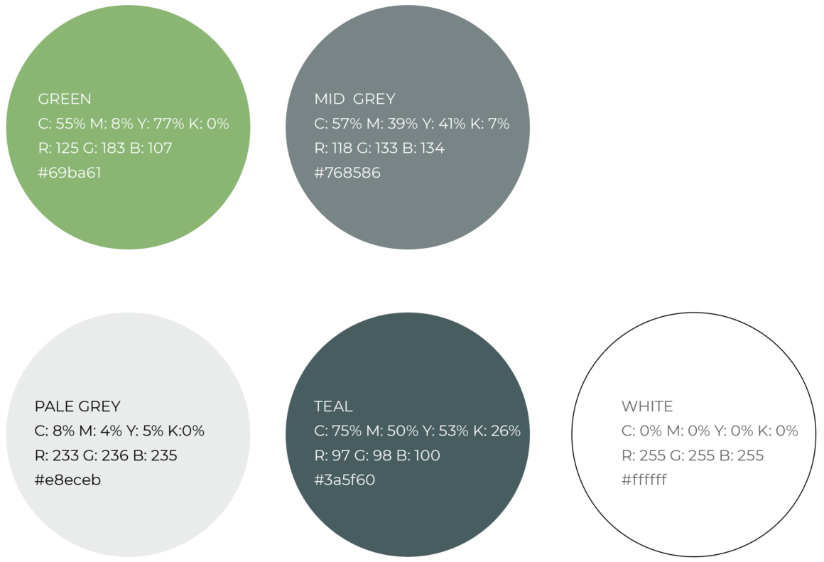
Primary colour breakdowns
RGB for screen for tools like PowerPoint and Word; Hex / values are for digital applications like our website. Whereas CMYK breakdowns are used for print collateral like business cards.
Green
C: 55% M: 8% Y: 77% K: 0%
R: 125 G: 183 B: 107
#69ba61
Mid grey
C: 57% M: 39% Y: 41% K: 7%
R: 118 G: 133 B: 134
#768586
Pale grey
C: 8% M: 4% Y: 5% K:0%
R: 233 G: 236 B: 235
#e8eceb
Teal
C: 75% M: 50% Y: 53% K: 26%
R:97 G:98 B:100
#3a5f60
White
C:0% M:0% Y:0% K:0%
R:255 G:255 B:255
#ffffff
Secondary colour palette
At times it may be necessary to use additional colours. This could include a graph or chart, or even to segment a document or within digital use cases for sections or to help highlight key areas of content, calls to actions such as buttons, or just to help lift a communication. This complimentary palette has been developed to work alongside our primary colours.
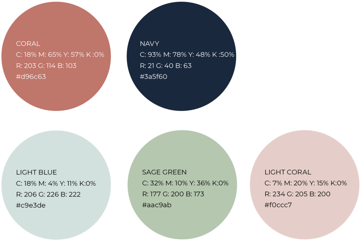
Secondary colour breakdowns
CMYK is used for print applications; RGB for screen for tools like PowerPoint and Word; Hex / values are for digital applications like our website.
Coral
C: 18% M: 65% Y: 57% K :0%
R: 203 G: 114 B: 103
#d96c63
Navy
C: 93% M: 78% Y: 48% K :50%
R: 21 G: 40 B: 63
#3a5f60
Light blue
C: 18% M: 4% Y: 11% K:0%
R: 206 G: 226 B: 222
#c9e3de
Sage green
C: 32% M: 10% Y: 36% K:0%
R: 177 G: 200 B: 173
#aac9ab
Light coral
C: 7% M: 20% Y: 15% K:0%
R: 234 G: 205 B: 200
#f0ccc7
Bright blue
C:57% M:20% Y:0% K:0%
R:79 G:176 B:255
#4fb0ff
Using colour
Finding a universal colour palette is impossible, as ability to see colour is unique. As a result, we do not use our colours alone to convey meaning, as we cannot guarantee that everyone can see our colours in the same way.
Consider this when choosing colours for things like green, amber, red to denote things like yes / no; start, ready, stop. Instead consider the use of shapes / icons, or within charts, you could use different textures such as lines to denote different ‘colour values’. Also, if describing colour, don’t try to be too clever. Instead use simple, descriptive language so instead of caviar, say black.
