Typeface
As part of our brand identity, we use a consistent fonts, to help build recognition for our brand. Typography enables you to create a particular context and have a certain personality.
Primary typeface
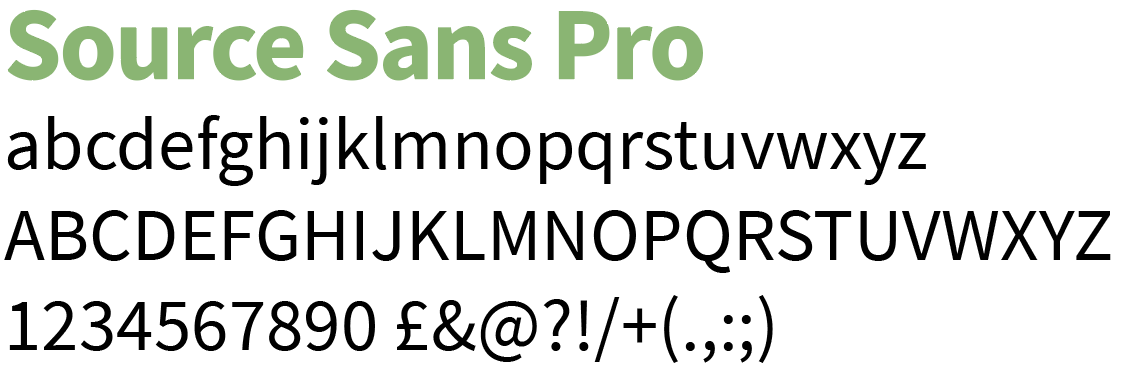
Our primary typefaces (font), should be used on all of our professionally printed communications and our website is ‘Source Sans Pro’, for headlines, headings and pull quotes. Please do not use any other typeface in conjunction with our brand.
Source Sans Pro was Adobe’s first open source typeface family, was designed by Paul D. Hunt. It is a sans serif typeface intended to work well in user interfaces.
Secondary typeface
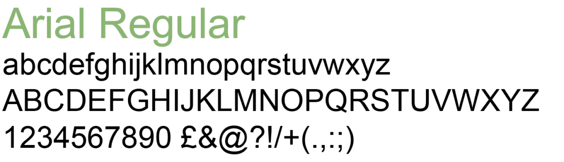
Not everyone is cool enough to have your typeface. So for some digital digital use cases, such as plain text emails, or if you’re not going to create a PDF document (which preserves the original typeface), our default font is ‘Arial’, which is a common system font for Macs and PCs.
Tips for sound typography
We want to ensure everyone can read our text clearly, regardless of who they are or what their ability may be.
- Try to stick to three, or a maximum of four different sizes within your document so there is a clear hierarchy to your information.
- Use headings that are bolder and maybe in a different colour to help people scan your copy / text.
- While we do use some CAPITAL text here and there, use it sparingly as it’s trickier for users who may have dyslexia to read. Don’t write large amounts of text in capitals.
- Always ensure that typography is laid out simply and clearly with plenty of space.
- All body copy should be set ranged / aligned to the left and never justified. And avoid large chunks of centralised copy as it’s not as easy to read as left aligned text.
Accessibility
Our audience is diverse and wide spread, and some may have English as a second language so it’s important that our use of typography is clean, clear and easy to understand. We’d suggest using a minimum size of 10pt for main body copy with a 2pt leading (line spacing) for things like Word Docs / Google Docs.