Logo applications
We want to keep our brand looking fabulous so we can communicate clearly and help build the recognition we deserve. Our logo has been designed and crafted with the same level of care and consideration as anything else we produce (maybe!).
Our logo
We have one logo, that we can use in two different ways. We typically use the landscape version, but when we’re limited for space, we can used the vertical, stacked version.
We can use the full colour version on white, soft grey or any light background or image, or we can use the white logo, on black, some secondary colours or any dark background or image.

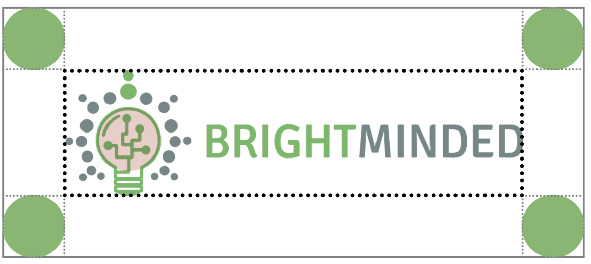
Exclusion zone
In order to protect the logo and make sure it is always legible and clear on all our material, we’ve developed an exclusion zone around it. This means that whenever we apply the logo to anything, it should have a clear amount of space surrounding it as shown. It is calculated by using the height and width of the circular shape in the bulb of our logo. This means it will proportionally have the same amount of space around it regardless of its size.
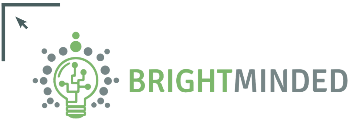
Position and size
Logo positioning
Due to the shape of our logo, it should always be aligned to either the top left or bottom left corner of any use case.
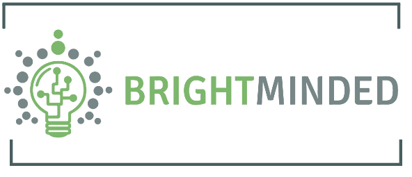
Minimum size
A minimum size of 50mm / 142 px wide has been established for all printed and digital material.
Incorrect use
It’s important that the our logo is correctly and consistently reproduced to help build recognition and understanding. Please do not re-colour the logo or squish it, and ensure if you’re using an image or background colour you choose the correct logo so that it is legible to maximise its impact.
The logo should not be altered in any way. It must NEVER be re-typed in another typeface, have the relationship between the elements changed, be distorted or appear in any colour other than those specified.