Photography
Did you know, 90% of information transmitted to the brain is visual. Your brain processes visuals 60,000 times faster than words. Visually-rich content and marketing allow us to communicate faster and more effectively.
Our photography
We tend to use stock photographs, however every effort should be made to portray ‘real’ people in positive situations who could have benefited from our brilliant technology solutions. Overly posed, cheesy or obvious ‘model’ shots should be avoided where possible as they don’t feel authentic. Maybe one day, we’ll get Sarah to come in with her massive lens and take some nice pics of us all….!?! 🙂
Photos should be selected with care and consideration, does the image look cool, does it reflect what we stand for and make us look good? By selecting engaging images that have something to say, we can really connect with our clients and community by bringing our work to life. Don’t just shove images into your communications, think how to use them effectively.
Our photography style is clean, clear and people-based to reflect the real-world where our technology lives – it should be images people and clients can relate to. Try to make sure images feel light and airy, that they use a narrow depth of field and have a reportage vibe to them so they feel less staged.
Using the correct imagery
Technology can be a difficult concept to convey or get across in a single image. So it can be helpful to think about the end impact or the end beneficiary. For example, AI isn’t a tangible visible thing, it’s actually lines of code and servers, but the impact is real world, it can have real impact upon humanity if used correctly. Whether we’re building a membership platform for a therapeutic association or an AI LLM that can help people solve problems, think about those kind of images instead.
Our imagery should reflect the diverse nature of our work, and showcase our expertise. When designing or creating work for a particular audience try to convey a clear message to the people you are talking to. If you’re really struggling to find a photo, have a think about using illustrations or graphics instead.
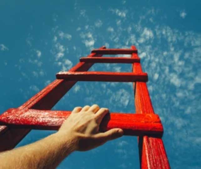
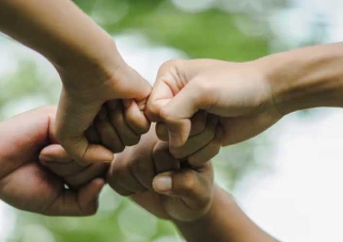
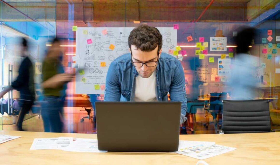
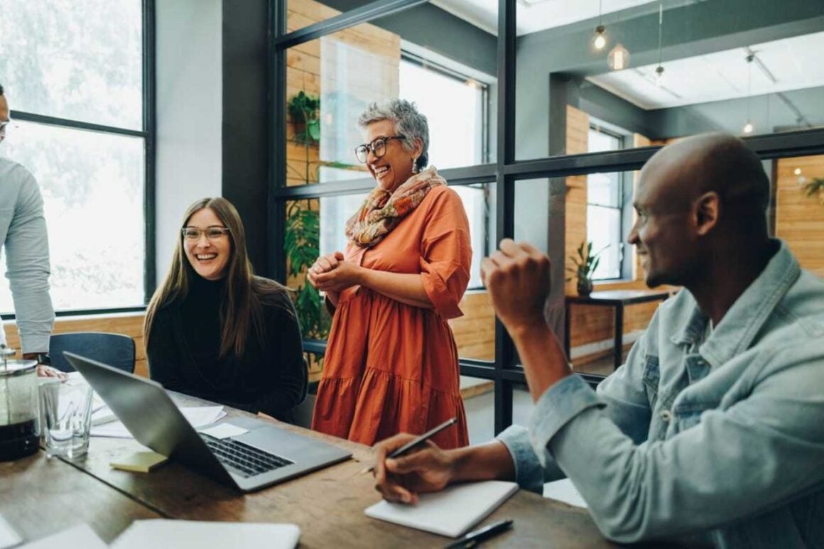
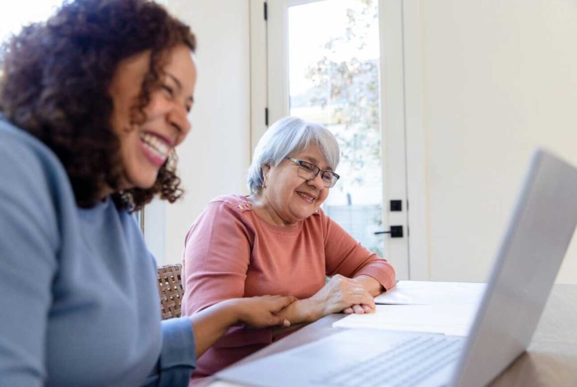
General images
These kind of images are great for presentations and documents where we may be talking about processes, working environments or the people we work with. Make sure they look quite cool, feel natural and not contrived.
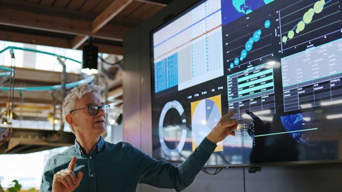
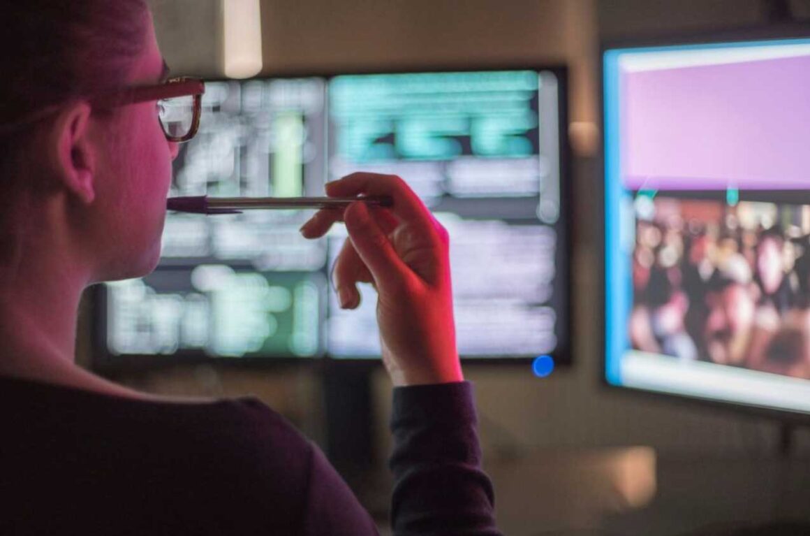
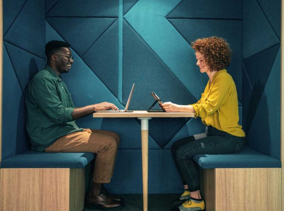
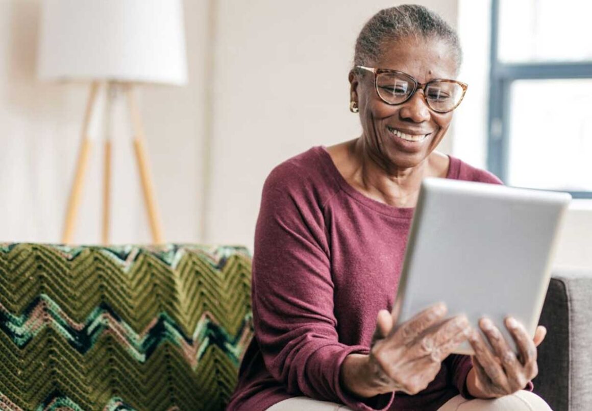
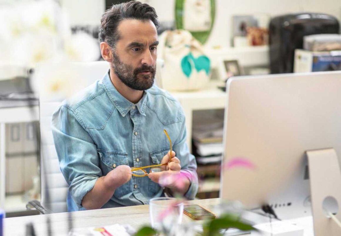
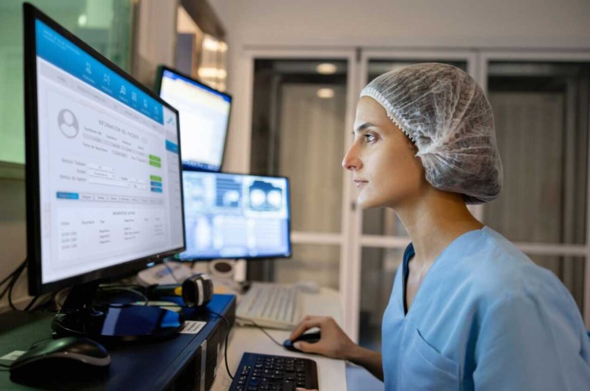
Tech being used
Sometimes we might want to talk about use cases, end users or people who may benefit from the digital experiences we make. Make sure the images look natural and like real people that we could relate to.
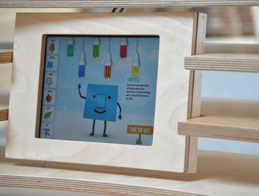
Folio work
Often for our portfolio we need to create mock ups of our work to showcase it in offline environments. Try and make these look cool, neat and tidy. We try and use a mix of close up detail mock ups and ones that are in some kind of home / work environment so they feel more realistic. And if you get really stuck, just ask our mate Sarah from Borderless to help. She also works for us on an ad-hoc basis and has a BrightMinded email so drop her a line.
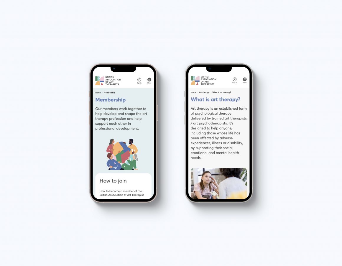
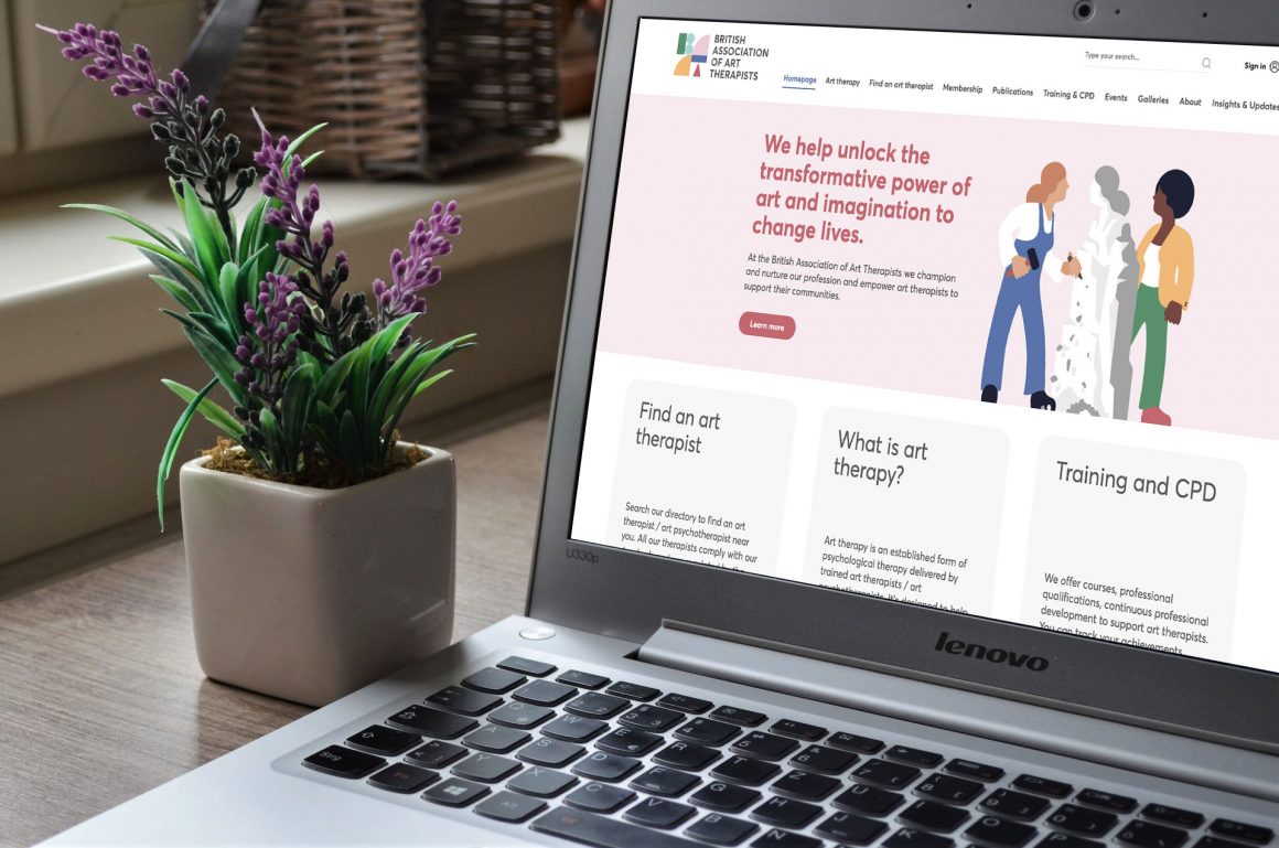
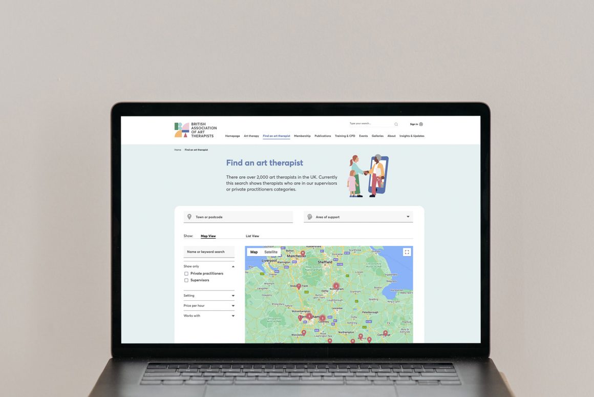
To make you’re own 3D image mock-ups, you can pay £8 per image and get them rendered onto different devices with background on them, just like the BAAT mobile images at the top.
Legal
Please only ever use images that you’re licenced to use from either our library, a photo stock library, a photographer you have an agreement with, or a referenced Creative Commons image. Otherwise you risk copyright infringement.
Image sources
Free ones: https://www.pexels.com/
Low cost: https://www.shutterstock.com/
Mid-range cost: https://www.istock.com/
Images styles to avoid
Avoid images that feel staged, have poor lighting or just look low quality and don’t look cool. Please don’t use montage or clip-art style imagery as it feels unprofessional, looks contrived, aka a bit crap, and spoils the impact of our brand. We also avoid using overly cliched or cheesey imagery as it makes us look a bit cheep and naff.
The examples below are the kind of thing we SHOULD AVOID USING.